Separate Mobile View doesn't works

#1
Hello,

I use Litespeed Cache module 1.2.7 with Prestashop 1.7.6.4.
My template is Zro03 - Supermarket Store, a popular one on Addons PS shop.

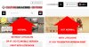
With this template, the code on the desktop and mobile version are different. But even if I select "Separate Mobile View"in LSC module, the version kept in cache is the first displayed after I clear cache, whatever it is desktop or mobile :
- If I clear cache and I go on desktop view first : I'll then have desktop version on mobile.
- If I clear cache and I go on mobile view first : I'll then have mobile view on desktop.
See attach files.

I even tried to deactivate the LSC module on mobile, but in this case I lost the hamburger menu on mobile !

I don't understand what I do wrong. Any help would be welcome :)

Thanks before.

Damien
 

Attachments

Pong

Administrator
Staff member
#2
LiteSpeed cache plugin only support warehouse theme. template Zro03 - Supermarket Store could be the issue.
 
#3
Thanks for your fast reply ! Only Warehouse theme ? I used LiteSpeed cache on LeoTheme templates and it works also well. Is it possible to configure the LiteSpeed cache module to make him ignore the header of the site (where the problem is) ?
 

serpent_driver

Well-Known Member
#7
Okay, but you can also be helped with PrestaShop. :)

PrestaShop has a build-in function that differentiate devices like desktop and mobile devices. This function may produce differently code for each kind device. If you use LScache you must define vary cache rules in .htaccess, so Lscache knows that your Shop has different output depending on device. This can solve your problem, but you can also try plugin function for separate mobile view. If this plugin function doesn't solve your problem, define cache rules.
 

LuigiMdg

Active Member
#8
Okay, but you can also be helped with PrestaShop. :)

PrestaShop has a build-in function that differentiate devices like desktop and mobile devices. This function may produce differently code for each kind device. If you use LScache you must define vary cache rules in .htaccess, so Lscache knows that your Shop has different output depending on device. This can solve your problem, but you can also try plugin function for separate mobile view. If this plugin function doesn't solve your problem, define cache rules.
I have the original template, but the separate cache from mobile still doesn't work....
How are these rules defined?
I have a VPS so I can intervene anywhere..
 

serpent_driver

Well-Known Member
#11
@ehsanai
The problem is caused by PrestaShop's outdated and not properly working device detection, which also works differently than the cache plugin's device detection. If you don't really use different code for different devices, then you should disable this feature.
 
#14
If there is a hook for this part, yes. Otherwise no.
there is a hook.


PHP:
{block name='header_menu'}
  {capture name="displayMainMenu"}{hook h="displayMainMenu"}{/capture}
  {capture name="displayMainMenuWidget"}{hook h="displayMainMenuWidget"}{/capture}
  {assign var='has_widgets' value=0}
  {if isset($smarty.capture.displayMainMenuWidget) && $smarty.capture.displayMainMenuWidget|trim}{$has_widgets=1}{/if}
  {if (isset($smarty.capture.displayMainMenu) && $smarty.capture.displayMainMenu|trim) || $has_widgets}
    <section id="top_extra" class="main_menu_has_widgets_{$has_widgets}">
     {if !$sttheme.megamenu_width} <div class="wide_container boxed_megamenu">{/if}
      <div id="st_mega_menu_container" class="animated fast">
      <div class="container">
        <div id="top_extra_container" class="flex_container {if $sttheme.megamenu_position==1} flex_center {elseif $sttheme.megamenu_position==2} flex_right {/if}">
            {if isset($smarty.capture.displayMainMenu)}{$smarty.capture.displayMainMenu nofilter}{/if}
            {if $has_widgets}
              <div id="main_menu_widgets">
                <div class="flex_box">
                  {if isset($smarty.capture.displayMainMenuWidget)}{$smarty.capture.displayMainMenuWidget nofilter}{/if}
                </div>
              </div>
            {/if}
        </div>
      </div>
      </div>
      </div>
  </section>
  {/if}
{/block}
this section hides if the first view is on mobile and after that on desktop did not load.
how to exclude this?
 
Top